SavvyUI
Native Components for Angular 2+ and React
Powerful, flexible, and easy-to-use!
Angular Demo and Documentation React Demo and Documentation Buy a License
Terms of use: You can install this library and use it for free while you're developing your application. When you're ready to release the product that integrates with the SavvyUI library, you must purchase a separate license for each developer involved in the development of that product
SavvyUI is a feature-rich component library for the development of Angular 2.0+ and React applications. It features a large set of native Angular and React components that can be used to create complex UI applications using Angular/React and Typescript. All the components have a familiar and easy to use API that can be used declaratively and programmatically. It comes with multiple built-in themes that can be employed as-is, or they can be easily customized as needed.
Click here for a demo, and to browse through the guide tutorials for this library
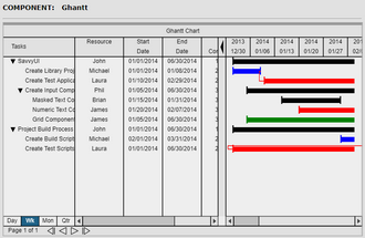
Ghantt Chart
Easy-to-use ghantt chart component to show the duration and progress of tasks, dependency between tasks, the resource assigned to each task in a hierarchy that reflects the relationship between stories and their sub-tasks.
Modal Popup
The SavvyUI library provides 2 modal dialog classes, one that is used to display Angular 2/React templates in a modal popup, and the other one is used to dynamically create modal popups from native html markup. The dynamic dialog class also includes built-in functions to display out-of-the-box confirmation and message dialogs, an InputDialog helper that includes helpers to add all kinds of input elements without dealing directly with HTML markup. Either one of these classes can be used to display modal popups, and they provide developers with greater flexibility, and more functionality than most other modal libraries offer.
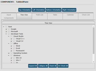
Tabbed Pane
This component is used to save precious screen space by allowing the developer to place large panels under different tabs, where they continue to be accessible to the user, without occupying so much space.
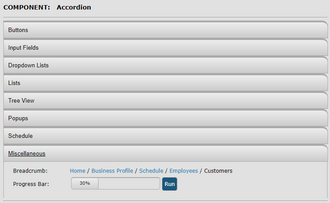
Accordion
A compact UI element that is capable of displaying a large number of UI elements without occupying much screen space. It can hold several panels that are folded, and then the user can make one panel visible at a time by clicking the panel's title. The accordion component automatically hides the currently visible panel and displays the newly selected panel whenever the panel header is clicked. Such component can be extremely useful in situations where the screen space is limited.

Split Panel
The split panel component allows you to place 2 panels side-by-side, or on top of each other, so that a user can resize these panels interactively to allow him/her to view more of a particular panel by dragging the splitter bar to resize these panels and give more space to one over the other.
Lists
A tree view, a check list, a sortable list, multi-select list, searchable list. Just to name a few of the list type components that are provided in the savvy ui library.


Picture Menu
The picture menu component can be used to display a grid of static image icons, display interactive menus with pictures that fire events whenever a picture is clicked, which makes a perfect solution for displaying menus to the user that display both text and images for touch-screen interaction.
QrCode
Powerful component to generate and display QR Codes from any text. QR codes are more precise and accurate form of barcodes that are less error prone, and easier to read with modern barcode scanners, they are also more flexible in terms of the type of data that can be used to generate these codes.


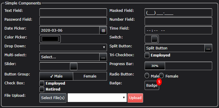
Buttons
A button component that can be configured to display 4 styles of buttons, primary, default, danger, and info.
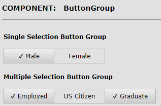
Button Group
A button group is a series of buttons that are displayed as a single group. Just like checkboxes and radio buttons, button groups can be configured to enable single or multiple selection. In single selection mode, only one button can be selected at a time; while in multi-selection mode, the user can make more than one choice.
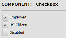
Check Box
The checkbox component is used to display a 2-state button that allows a user to choose between two options.
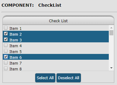
Check List
The checklist component is used to display a list of checkbox items. This type of component is presented to the user in situations where options can be turned on or off for a particular entity. For example, when assigning roles to employees, using such component to present all the roles to the user to select one or more of these roles to assign to an employee is one of these scenarios that this component can be used to achieve such behavior.

Cards
A Card component can be used to display information and an image of a product, a personal profile, or a product details. A card formats the image and the text in a way that provides an easy eay for an application to focus the users' attention to the information displayed on the card.
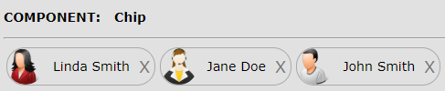
Chips
Chips are compact elements that represent an input, attribute, or action.
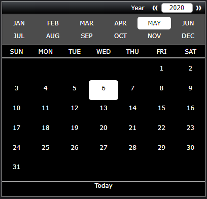
Calendar
A powerful calendar object that can be displayed as a popup, or placed permanently inline inside a particular application view. It allows for easy navigation between years, months, and days, and it also provides an input element to quickly type in a specific year to navigate to.
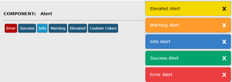
Alerts
The alerts component can be used to relay different types of messages to the user. It can be used to attract the user's attention to errors, warnings, information, and more. There are several types of alerts that are supported in this component, the alerts come in different colors, each color indicating the type of message being relayed to the user.

Pie Chart
The chart component includes the ability to display charted data as a bar graph, a pie graph, a doughnut graph, and a line graph. Using the same data that the application feeds that chart component, the application can quickly display any of these types of graphs from this data with a single function call to set the type.
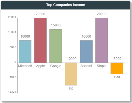
Bar Chart
The chart component includes the ability to display charted data as a bar graph, a pie graph, a doughnut graph, and a line graph. Using the same data that the application feeds that chart component, the application can quickly display any of these types of graphs from this data with a single function call to set the type.
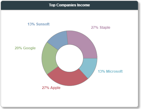
Doughnut Chart
The chart component includes the ability to display charted data as a bar graph, a pie graph, a doughnut graph, and a line graph. Using the same data that the application feeds that chart component, the application can quickly display any of these types of graphs from this data with a single function call to set the type.
Line Chart
The chart component includes the ability to display charted data as a bar graph, a pie graph, a doughnut graph, and a line graph. Using the same data that the application feeds that chart component, the application can quickly display any of these types of graphs from this data with a single function call to set the type.

Data Grid/Table
Support for inline editing, embedded form editing, and popup dialog editing, paging, scrolling, sorting, filtering, built-in support for a vast number of editing styles.

Chart
Chart component that includes a pie chart, a doughnut chart, a bar chart, and a line chart. No dependency on any other library.
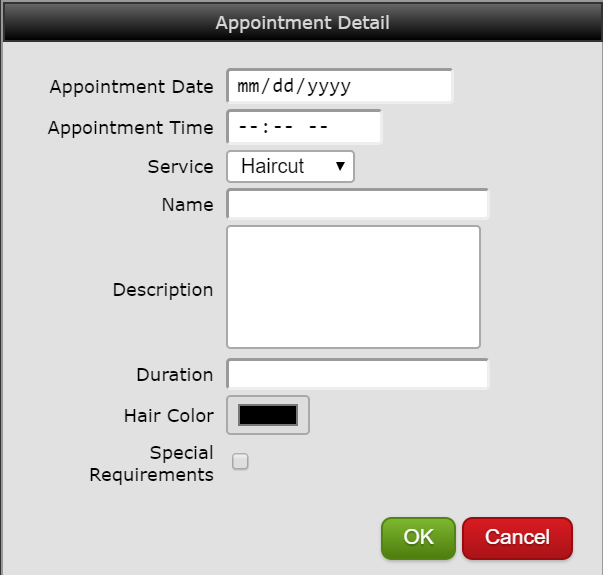
Appointment Book
Advanced appointment scheduling component that supports built-in editing capability, dragNDrop, scrolling, and more.